Influencer Landing Page Design for Campaign Traffic Conversion
Personalized landing pages convert influencer traffic ten times better than generic ones.
A visitor who taps a creator's link arrives already convinced of something. The trust that got them to click belongs to the creator, not the brand, and the landing page is the only place where that borrowed trust either gets honored or spent for nothing. When the page on the other side ignores the context of the click, shows generic brand copy, or pushes an offer that bears no visible relationship to what the creator just said, the visitor feels the mismatch immediately and leaves. This article argues that the design of that page is where most campaigns actually win or lose. The scale of the problem is measurable: the average influencer marketing conversion rate sits well under one percent as of June 2025, while optimized landing pages across industries can reach above 10 percent. That spread is too wide to be explained by audience quality or influencer selection, and it points to the page itself as the primary variable under a brand's control.
Landing page quality for smaller creators
The brands most exposed to this problem are the ones working with nano- and micro-influencers, precisely because those relationships carry the highest trust density per click. Industry benchmarks across Beauty and Skincare, E-Commerce/Retail, and SaaS/B2B all show a meaningful spread between the lowest and highest performing pages in their category, and that spread is driven almost entirely by what happens after the visitor clicks, not by which influencer sent them. A brand that selects its creators carefully and then routes every one of them to the same generic page undermines its own effort by neglecting the page itself. The influencer relationship can be flawless and the conversion outcome will still be set by the page, because the page is where the trust the creator built gets either carried forward or discarded. Treating creator selection as the primary lever, while leaving landing page design as an afterthought, misallocates the effort where it matters least and underinvests where it matters most.
Message match as the primary trust signal on a landing page
The clearest signal a visitor reads in the first few seconds on a landing page is whether it continues the conversation the creator started or abandons it. When the headline, imagery, and offer on the page echo the specific language and framing the creator used, the visitor experiences continuity, and continuity is what trust transfer actually looks like in practice. When the page instead reflects the brand's general positioning copy, built for no one in particular, the visitor notices the seam between what they were told and what they're now looking at, and that seam is where conversions are lost. Marketers can track traffic source through UTM parameters and use that data to personalize the headline, hero image, testimonials, and offer shown to each visitor, matching the page to the context they arrived from. The Papa Murphy's campaign with creator @JohnEatsCheap on TikTok, running across 2025 and 2026, demonstrates why this works when it works: the creator already matched the buyer persona so closely that trust was established before the landing page ever loaded, and the page's job was to sustain that match rather than construct it from nothing. That case also points to a real limit on personalization as a tactic. Dynamic personalization requires enough traffic to learn from, and segments smaller than roughly 1,000 weekly sessions typically underperform a single, well-written generic page, because splitting too few visitors across too many variants fragments whatever signal the data could have produced. The usable rule that follows is straightforward: personalize where segment size, the meaningfulness of the variant differences, and the ability to measure outcomes all support it, and fall back to one carefully matched page per campaign everywhere else.
Social proof placement as the mechanism that deepens borrowed trust
Message match establishes that the page belongs to the same conversation the creator started. Social proof is what deepens that trust once the visitor is already reading, and where it sits on the page is not a cosmetic choice but a functional one. Placing social proof directly below the call-to-action can meaningfully increase conversion, and customized calls-to-action on their own improve performance by 202 percent, which makes placement itself part of the mechanism rather than decoration applied after the real design work is done. The scale of the missed opportunity here is notable: most consumers read testimonials before buying, yet fewer than one in four marketers actually put social proof on their landing pages, leaving a wide gap between what is known to convert and what most brands actually build. For traffic arriving from an influencer's link specifically, the proof that carries the most weight is proof that stays inside the same creator relationship: a screenshot of the creator's own post, user-generated content from people in that creator's community, or a direct quote from the creator placed near the CTA. This matters because it extends the same trusted voice the visitor already followed, rather than introducing a new and unfamiliar one at the exact moment a decision is being made. WiserNotify's work with customer Nicholas Scalice shows the same mechanism operating at the level of a single page element: adding social proof notifications to an opt-in page produced a meaningful increase in signups, because the notifications made existing conversions visible to new visitors as they arrived, compounding the trust signal already in motion. Testimonials and proof elements perform best when matched to the visitor's own context, industry, or demographic rather than pulled from a generic review pool; an audience sent by a fitness micro-influencer responds to proof from people who look like them, not to an enterprise case study with no bearing on their situation.
One Offer, One Page: Matching Format to Offer Complexity
A landing page that presents the visitor with more than one offer, more than one call-to-action, or an unclear next step is asking them to make a decision that nothing in the creator's content prepared them to make. That decision friction is where the momentum built by the click gets spent without converting into anything. Multi-offer pages produce a sharply negative conversion impact compared to single-offer pages. The operational standard by 2026 is one page built around one job, with traffic segmented into the right audience before it ever arrives, so each page can stay focused on a single outcome. This isn't a case for minimalism as an aesthetic preference; it's a case for removing anything that competes with the one action the page exists to produce. The common objection, that long-form pages underperform shorter ones, misreads what the data actually shows: long-form pages generate substantially more leads than short-form pages for high-ticket offers, but only when every section of that length still serves a single offer, carried through visual storytelling and collapsible FAQs that make scrolling feel natural rather than introducing new, competing choices. The format decision should follow the complexity of the offer and the audience's readiness to act. A direct-purchase skincare offer sent by a beauty nano-influencer's audience calls for a short, fast page because the decision is simple and the audience arrives ready to act. A B2B SaaS demo request sent by a LinkedIn creator's audience often calls for a longer page, one that works through objections progressively before presenting the CTA, because the decision carries more weight and the audience needs more handling before it will move. The practical question to ask when building any page is how much objection-handling this specific audience needs before it's ready to act, and to build the format around that answer rather than around convention.
Mobile speed as a trust variable, not just a technical metric
Nearly all influencer traffic arrives through a tap on a phone screen, on Instagram, TikTok, or YouTube, and a page that loads slowly communicates unreliability before the visitor has read a single word, undoing the trust the creator just spent their credibility building. Mobile devices account for the large majority of all landing page traffic in 2026, and influencer-driven traffic is among the most mobile-concentrated of any channel, yet mobile still converts measurably less than desktop, with a significant share of conversions lost for every additional second a page takes to load. Three factors compound to produce that gap: slower average load times on mobile connections, smaller screens that make forms harder to complete, and lower scroll depth overall, and each of these erodes the narrow window of attention the creator's content opened in the first place. Pages that load in roughly 2.4 seconds convert nearly twice as effectively as slower ones, which makes speed a primary lever in the design of the page rather than a technical detail addressed once the design is finished. Every decision that affects load time, how images are compressed, how fonts load, how many third-party scripts run, how many fields a form asks the visitor to fill in, is in this sense a trust decision rather than a purely technical one. A page that stalls for a visitor watching on a train or standing in line has already broken the experience the creator set up, regardless of how well the copy on that page might read once it finally appears.
Dedicated pages per creator as an operational standard, not a best-practice aspiration
None of the preceding principles function unless each creator sends traffic to a page built specifically for their audience. Message match, social proof matched to context, single-offer focus, and mobile speed all depend on the page being built around one audience's expectations rather than averaged across every audience a brand works with, and routing every creator into one shared page makes that kind of precision structurally impossible. Attribution is what forces the issue. Every creator relationship should produce a traceable path into the brand's systems, whether that's a promo code, a custom landing page, an affiliate link, or a booking URL carrying UTM parameters, and that tracking needs to reach past the first click into the analytics stack, the CRM, and backend revenue data through UTM tagging, dedicated pages, and CRM source fields that persist through the full customer journey. Without that infrastructure, a brand has no way of knowing which creator-page combinations are converting and which are not, and no way of improving the ones that aren't working. The Strawberry Milk Mob, led by Georgia Costello and recognized on Forbes' 30 Under 30 list in 2026, shows that this standard doesn't require enterprise resources to meet: a "done is better than perfect" approach paired with authenticity-driven content, traced cleanly through to outcomes, demonstrates that dedicated and traceable pages are achievable at small scale as well as large. AI-powered personalization and testing tools have also made building multiple page variants and running meaningful tests on them far cheaper than it once was, which removes much of the cost argument that previously made a single shared page look like the reasonable compromise.
Where the Landing Page Is Being Bypassed
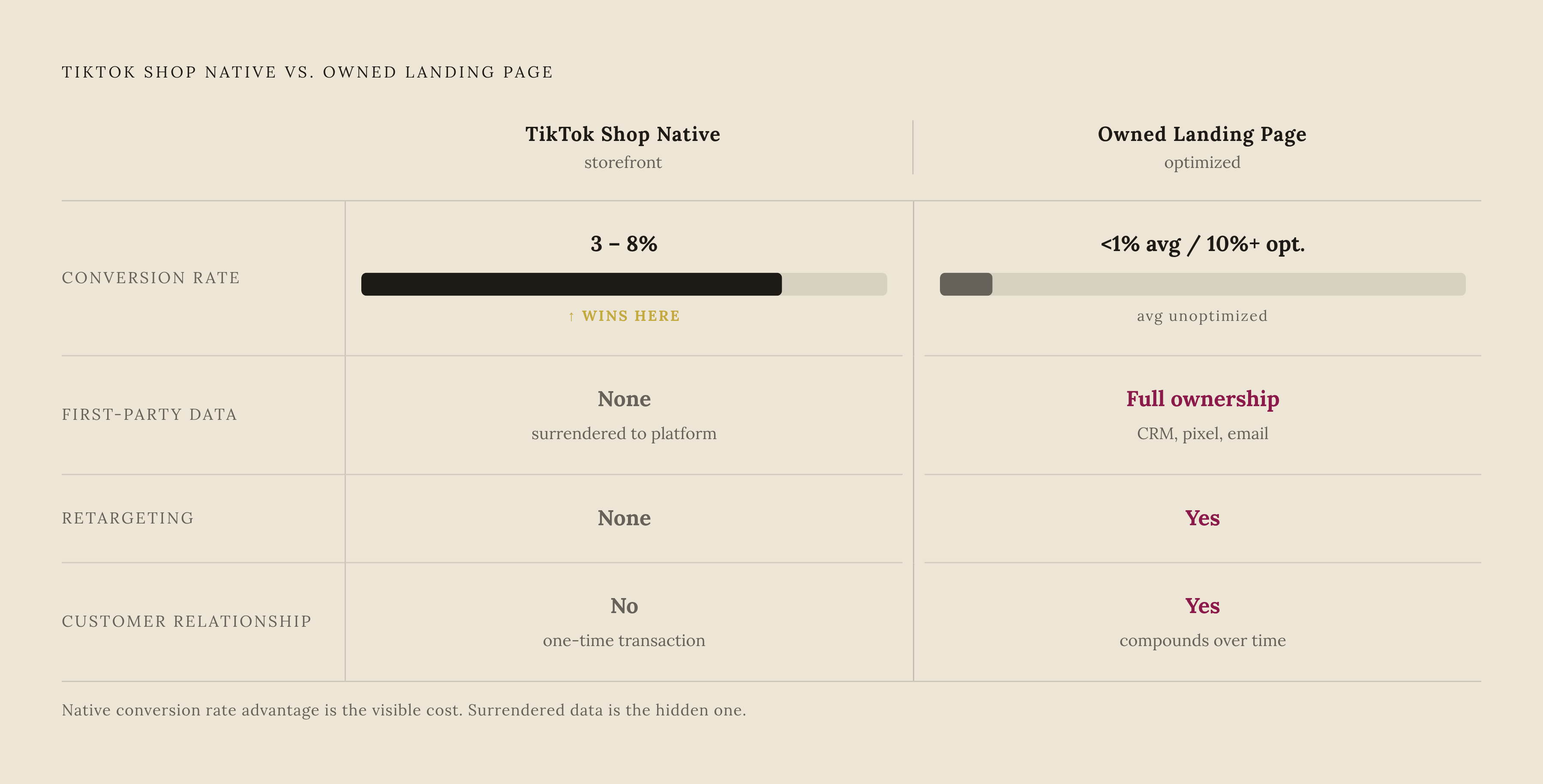
The framework built across this article assumes the landing page remains the destination, but for a growing share of campaigns, it is being removed from the path. Platform-native storefronts now let the purchase happen inside the same app where the trust was built, closing the gap between seeing the creator's content and completing the transaction without ever sending the visitor anywhere else. TikTok Shop integration, mature by 2026, enables direct e-commerce with conversion rates of 3–8 percent, outperforming web-link conversions for many campaigns because the purchase happens without the friction of leaving the app. That convenience comes with a structural cost. Native storefronts convert more easily but leave the brand with no first-party behavioral data, no CRM record, no retargeting pixel, and no post-purchase relationship it can shape going forward. An owned landing page asks more of the visitor but gives the brand full ownership of the data it generates, the ability to retarget, and a direct relationship with the customer that compounds in value over time in ways a platform-native purchase never does. The choice between the two is a genuine strategic trade-off rather than a simple matter of which converts better in the moment. Brands building toward long-term customer relationships and owned audience data still get more value from the landing page built around trust transfer, while native storefronts serve as a volume shortcut, trading the depth of that relationship for the convenience of an immediate transaction.
Sources
- Landing Page Statistics 2026 (Backed by Data Marketers Actually Use)
- 15 Best Landing Page Statistics for Digital Marketers in 2026
- Landing Page Statistics 2026: 120+ Conversion Data
- TOP 20 LANDING PAGE CONVERSION STATS 2026 THAT EXPOSE BRUTAL FUNNEL FAILURES
- Influencer Benchmarks 2026: Real Rates, ROI & Engagement...
- I Tested 10 Social Proof Landing Page Tactics (2026)
- Average Conversion Rate for Influencer Marketing in All Industries (2025)